
Many polymer clay colorists and teachers are concerned about Polyform Products’ announcement that the company is changing its Premo color palette. While I prefer to avoid manufacturing topics, this is one where several dear friends who could be impacted have asked PCD to get the word out in hopes of making a difference.
Please read and then add your voice to the matter. We’d like to urge the company to rethink its decision. Some relevant links are listed below.
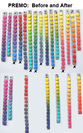
Among Polyform’s changes, two primary colors, essential for color blending and teaching color theory will be eliminated from the Premo line. Zinc yellow and cobalt blue, essential for most of the primary blends shown here, will no longer be available.
An x below a strand in the top row of Premo blended samples indicates an affected color. The bottom row shows the remaining colors. Thanks to Carol Simmons for the illustration.
If you’ve ever seen the meticulous, laborious processes that polymer colorists and teachers go through to develop their theories and formulas, you can understand their distress. Fine artists who rely on signature colors for their livelihood, will be forced to undergo costly reformulations.
We applaud Polyform’s appeal to the hobby market whose vitality improves the future of our craft. At the same time, we appeal to the company consider the needs of the artists who have supported them and who continue to expand the use of Polyform products and make the brand visible to a wide audience through fine art, education, and research.
- Polyform on Facebook (comment here)
- Polyform email (write the company direct)
- Carol Simmons’ explanation
- Cindy Leitz’ virtual petition
- Lindly Haunani’s post (with links to more)
Thanks for helping. Tomorrow we’re back to beauty as usual!
Margit Böhmer ,
Thank you Cynthia for this topic, I did not now from the decision until now, and I can’t understand it. Cobalt blue, zinc yellow and copper are such essential colors, we absolutely need them.
I hope that a lot of artists are writing emails to polyform and that the company will react to the needs of their customers and continue with the 3 mentioned colors.
Liz Hall ,
Wow I had no idea, will write the company and FB them. If anything I was hoping with the new whiter white that they may have been considering adding more colors to premo not less!
Pippa Chandler ,
Thank you for posting so many links Cynthia. I have posted on FB, emailed them directly and posted on a couple of the other links also.
This is such an important issue and we should all add our voices to make Polyform aware of how we feel.
Many thanks again.
genevieve ,
Well this is certainly unsettling news first thing in the morning but I appreciate you keeping us up to date, Cynthia!
What a huge backward step for the medium, to take primary colors away. (Think of the uproar if Prismicolor or Prang decided to eliminate primaries! My goodness, I think violence might ensue.)
Chris Wrinn ,
If it’s cost issue, raise the price. If we need the medium, we’ll find a way to pay for it. Could you imagine taking those colours away from a painter? Anarchy! Please rethink this, Polyform.
Dakotah Flannery ,
Cynthia, thanks for the info. I had noted they were changing some colors but didn’t pay attention to which ones until your post. I have written to the company and I have posted on the Houston Polymer Clay Guild yahoo group asking my fellow clayers to do the same.
I just took Lindly’s textile technique class less than 3 weeks ago specifically to learn better color technique. I learned so much and she is such a great instructor, I just can’t stand the thought of all that work going away and her having to start all over again.
Thank you for the opportunity and information needed to try and make a difference. dlakotaqh
Carol Simmons ,
Thanks, Cynthia, for helping get the word out.
Susan O'Neill ,
Adding new colors is progressive, but discontinuing basics that you’ve built your line (and a loyal following) upon is just BAD marketing! Aside from the HUGE issue with the primaries and Sea Green, don’t forget that the Frost is the only “translucent with bleach” formula and one which those of us who especially love the imitative minerals techniques will greatly miss!
Lili Velez [Rhet] ,
The question is, of course — _whose_ opportunity is this, really? Certainly artists will speak up, but are there enough artists to make any impression on a marketing decision? Many of us were under the impression that the Sculpey and Studio brands were meant for children and casual hobby work and the Premo! brand was for the artists — isn’t that why Polyform branded it “an artist’s dream come true”?
But when I was looking at the outgoing colors and the names of the incoming colors, you could see that terms artists knew “cobalt blue”, “zinc yellow” were being replaced by terms that mostly evoke food or fashion: Denim, Spanish Olive, Navy Blue, Blush, Wasabi, Pomegranate, Candy Pink, Sunshine, and Rhino Gray. Those aren’t artist’s terms.
[what follows is adapted from my comments on Polymer Clay Central]
For generations, artists had to find and grind their own pigments, go to quarries to select stone, know how to work with molten or kiln-fired materials. Some of these activities were hazardous, and some of them were deadly: the real arsenic green and cadmium red pigments were truly toxic — there’s a level of color commitment I don’t think we can match today! If you wanted clay, you went and dug it, or you got an apprentice to do this work for you. It’s only in the last few generations that an artist could go to get neat little tubes of color, or pastels, or gesso pre-mixed and ready to go on a pre-fab canvas.
Many of us gravitated to polymer _because_ we could grab a package off the shelf and start creating — we could skip a lot of traditional practices because we had the grinding and mixing done for us….but now we see the trap: We can mix colors [if we’ve got the right starting colors], and we can mix pearl shades [if we’ve got mica particles in a translucent base clay, or a lot of Pearl-Ex and patience ;-)]. We can pursue surface techniques and forms to our hearts’ content. But we’ve started with a package of something that some large corporation made, and that leaves us at a huge disadvantage: we _think_ we’re in control of our medium, but we’re not.
We like to think we are the core users of this product, but apparently that isn’t true either.
How does someone convince Polyform that having a good cold yellow [zinc] and cold blue [cobalt] are important if school children just need something to approximate “water in the ocean”? [As to why a company would have an “artist’s line” that was really marketed to children — that’s a traditional marketing method: the aspirational parent will want to buy a more expensive toy or art medium for a child to show they only give the very best]
We’re a young art; it’s going to be awkward for a while.
Lupe Meter ,
I would also say, that it is a step backwards. Whoever is in charge and making decisions at Polyform should have their head examined or shouldn’t have that position. Our guild (AZPCG) is very upset and we have sent an email out to our members so they can email them or write to them explaining their huge disappointment. I also couldn’t believe that Frost was also among the primary clays that are being discontinued…as we use that for Mokume gane techniques. I think by getting rid of their primary colors, we would be forced to buy their new premixed colors…unbelievable!
Marcie ,
Polyform doesn’t listen, they proved it when the softened the Premo line to the sticky mess that it is today. They prove it as they continue to market SIII which is defective. Give it up folks and move to a stable, tested, artists clay. I mean Kato.
Just because you can’t get Kato for a buck a pack isn’t an excuse for supporting a company that doesn’t give a darn about artists who make a living depending on their product.
Sue Ossenberg ,
They also discontinued what I considered standards – bright red, navy blue and leaf or sap green. These were not available in the 2 oz. packs (to my knowledge) and I never say them in stores; and probably a lot of folks didn’t realize they were available in 1 lb. blocks online. It’s a shame. Premo! is pretty much the standard for my pc classes and we need the current colors!
Lindly Haunani ,
Thank you for taking the time to venture out of your zone and help to get the news out about Polyform’s new color line-up…
caren goodrich ,
You can always buy dry pigments and mix your own color into translucent clay. I do that a lot but I understand it’s a pain and it’s not going to appeal to everyone, especially teachers. But for me, it’s better than relying on the whims of a manufacturer and I feel like I’m in control of the situation (until they discontinue translucent!)
Check out sinopia.com for artist’s dry pigments. They have a canary yellow that is a cool primary yellow.
Erlinda Mersino ,
I was just on the Polyform facebook page and they are going to make every effort to keep Colbalt Blue and Zinc yellow… THEY HEARD US!!!!! Yay!!
jana ,
I have, for a long time, been aware that my self-expression with polymer was susceptible to the whims of those who manufacture the clay. I know that those of you who love clay are aware of that uncomfortable, precarious position. I’ve often hoped that if, for some reason, polymer was no longer available, I’d be able to adapt and take the change head on – that maybe it’d open new avenues of creativity….but I know that’s wishful thinking and that I’d probably not take on the challenge so stoically :). Situations like this (with Polyform) bring that scenario just a little closer to plausible, and it’s scary. I really sympathize with you Premo users….while I don’t use Premo, I feel like this affects all of us regardless of the clay we use. If one of our own is unable to express themselves with this very powerful medium, I’m sure we’re all empathetic to how they’re feeling…in many ways, I believe it affects us all. I would hope that if enough of us contact Polyform, our collective voice would be heard…let’s speak up (regardless of the brand you use!); I’m going right now to write to them..
Janice Sears ,
I wrote on their Facebook wall and their current status is that they have heard us and are keeping Cobalt Blue and Zinc Yellow! Hooray!
Iris Weiss ,
Polyform has reviewed all of your heartfelt comments in reference to Premo Cobalt Blue and Premo Zinc Yellow. In response to your needs we are going to find a way to keep these colors available for you. We will work with distributors and will post the information as soon as we finalize it.
To answer some of your other concerns:
• Frost has been renamed White Translucent in order to clarify it’s color to new users. The color has not changed.
• Copper has changed, there will be a color recipe to create the older version of this color. The new Copper color is closer to the color of a new copper penny.
• The fluorescent colors have been discontinued. Two new colors, Wasabi and Candy Pink are quite bright and sure to make a “color pop” in your creations.
• The recipes for discontinued colors, with the exception of the fluorescent colors, will be available. Many of the recipes use new colors so releasing the formulas now will not help you. We’ll release the formulas on January 3rd when the new colors are going to be available to ship.
We are really excited about our new line of Premo Accents, Premo and Sculpey III, as we’re sure you will be. Designers who have already used these colors are singing their praises. They’re on trend, as well as colors designers have requested.
Your comments were heard, your loyalty appreciated.
christi friesen ,
I use Premo, it’s definitely my favorite clay for sculpting. As usual, i wasn’t paying attention, and when the comments started, i took a look at the list, and to my horror, some of my favorite colors are in the bye-bye list! No more green pearl? How will I survive?!!! Auuuugh!
The nice thing about change, though, is that it can go the other way too! I’m going to let Polyforms know what i feel, along with the rest of you – sometimes marketing doesn’t know what we purchasers are thinking, wanting, needing….
I am thinking lovely positive thoughts for the return of those colors we all can’t live without!
cf
pattw ,
Received an e-mail form Polyform today ! They are keeping Cobalt Blue and Zinc Yellow …..YEAH -we won round one. On to round two – all the other colors we deem necessary.
I e-mailed direct to Poly-form yesterday. Had the answer today. Best to go direct. What a load off our collective minds,huh?
Of course, I already ordered these color and some others. Day late and a dollar short LOL
Beverlyjane ,
I have written directly to them. Hope all of our e-mails will do the trick. I sure would hate to lose favorites.
sabine ,
Isn’t it fabulous, when a company listens to the consumer. Thank you for keeping the colours and a big thank you to all those who voiced their heartfely concerns.
I was already thinking about how to get around not having those colours – my colour scheming is very flexible. I however felt the pain of those who’s business and creativity relies so much on continuity of product lines.
I love premo for it’s softness and ease of conditioning. I just cannot manage the harder brands, It is a challenging in warmer weather at times, however it fiems up with resting.
The colour that really bothers me right now isthe new white – it’s so chalky and has quite a different texture from all the other colours.
I love Carol’s chart, although a larger version of it would get the point across better. When I blow it up the colour differences are far more prominent.
Amy E Wallace ,
Thanks for this Cynthia. I sent them an email. I hope everyone does.
Sera Pinwill ,
Well it worked – 🙂
Congrats to everyone who got off their behinds and emailed the company. The Save Our Colours campaign has been at least a partial success… Now lets hope that their “white transluscent” (huh???) is not really white!
Cheerz!
Kylee Milner ,
I wrote to Artemio who supply us here in Europe and also Wayne March – I received a positive response back similar to that of Iris Weiss above!
Heather ,
Thank you so much for bringing this issue to our attention. I have seen a lot of my supplies for the products I make disappear off the shelves of Michael’s and Joann Fabrics this year. It is very discouraging so I wrote a letter to Polyform also. It is hard enough to sell my products I don’t want to add more shipping costs to my supply purchases and spend more time to revamp recipes for color.
christi friesen ,
So now, i’m actually kinda excited about the new colors – some of the listed ones look pretty sweet. And since the yellow and blue are back (how cool is it that the reaction to our opinions was so swift and so positive!) i can even feel a little better that my own personal color (green pearl) won’t be coming back (luckily it’s easily recreated from the list of new and keeper colors, so all’s well in the world today.
cf
Jenn Oates ,
I wasn’t worried about the new colors, I’m like a greedy kid with new colors…I just didn’t want them to take away the important old ones. You can’t very well make primaries from…errr…other colors. I’m glad they listened and took a step back.
Sabine ,
Without this controversy I would never have sat down to create colour mixing charts. I had a wonderful eye-popping learning experience thanks to all of you. I have embraced zinc yellow and cobalt and will probably never go back to using tertiary packet colours.
Pörrö ,
I am copying this message I wrote as I think word needs to get around about this. The publicing of the news is so conviently in Xmas time that I am afraid people will miss this if we do not intentionally spread the word.
I stumbled into polymer clay express blog
pce-artway.blogspot.com/2010/12/clay-news.htm l
where there is a text “Great News!!!
We will be carrying Zinc Yellow and Cobalt Blue Premo throughout 2011!! We are one of three companies that will be doing so. ”
so when polyform promised that they will continue those colours they actually, IMO, lied. There is no promis about continuing then further and also this this does not help my situation a bit as I am selling clay for my customers in Finland and not buying it retale for my own use. I am dissapointed and this truly ruins my xmas 🙁
This is what I posted to polyforms facebook page
http://www.facebook.com/pages/Polyform-Products/1065 51216055451
“I just readed from polymer clay express that actually, on contrary to your promise, you are NOT going to make the cobolt blue and zinc yellow available to all customers as we here in europe that are selling the clay are not going to buy your clay from retalers.
I am dissapointed on your desicion and I think you lied when you tried to convince the audience that you are “keeping” the zinc yellow and cobolt blue. “